When it comes to laser cut acrylic signs, colour plays a big role. It’s not just about looks—it’s about making sure your sign stands out. The right colour choice can improve visibility, especially from a distance or in low light. Whether the sign is mounted indoors or outside, contrast helps people read it faster and easier.
If your sign is meant to grab attention, bright colours like red, yellow, or white on dark backgrounds work well. For professional settings, neutral tones like black, grey, or brushed metallics often suit the space better. The colour you choose affects how quickly your message is seen and remembered.
What makes colour choices important for branding?
Your brand’s colours are part of your identity. So when using laser cut acrylic for signs, consistency matters. Matching your brand colours to your signage helps build recognition and trust. Whether it’s a logo cut-out, product name, or a welcome sign, colour helps tie everything together.
Using the wrong colours, or low-contrast combinations, can confuse customers or make your sign fade into the background. Good design and thoughtful colour choices can give your acrylic signage a polished, professional look that supports your brand image.
Popular colour finishes in Acrylic sheets today
What colours are trending in signage and decor?
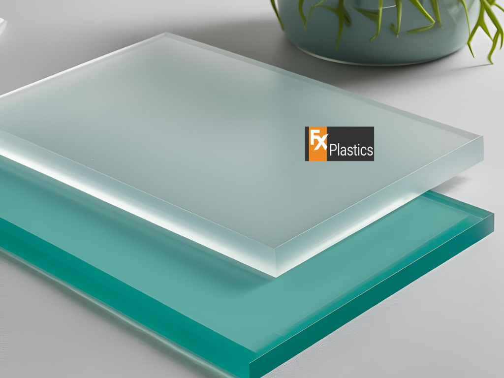
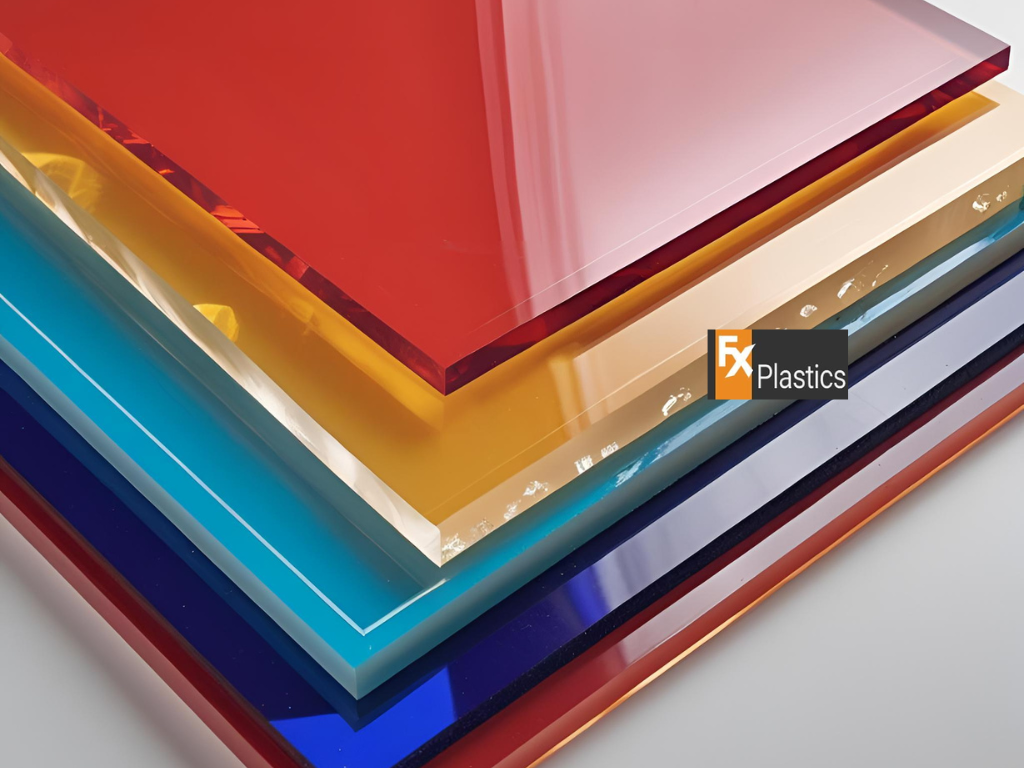
Right now, popular Acrylic sheets include classic options like gloss white, jet black, clear, and mirror silver. These are perfect for clean, modern signs. But bold colours like red, royal blue, or bright yellow are also popular, especially in retail or event settings.
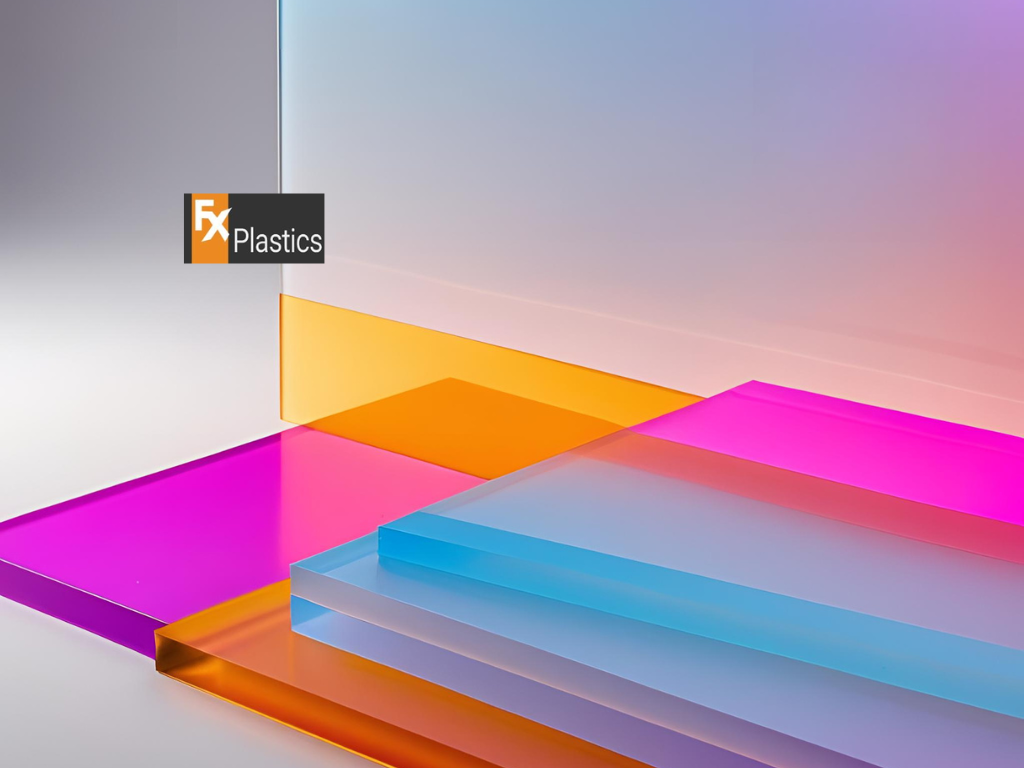
Frosted and pastel Acrylic sheets are trending for boutique signs, wedding décor, and minimalist branding. They offer a soft, stylish look while still keeping the text or logo readable. For playful or creative environments, multicolour layers or neon acrylics can make a sign truly pop.
How do gloss, matte, frosted, and mirrored Acrylic sheets compare?
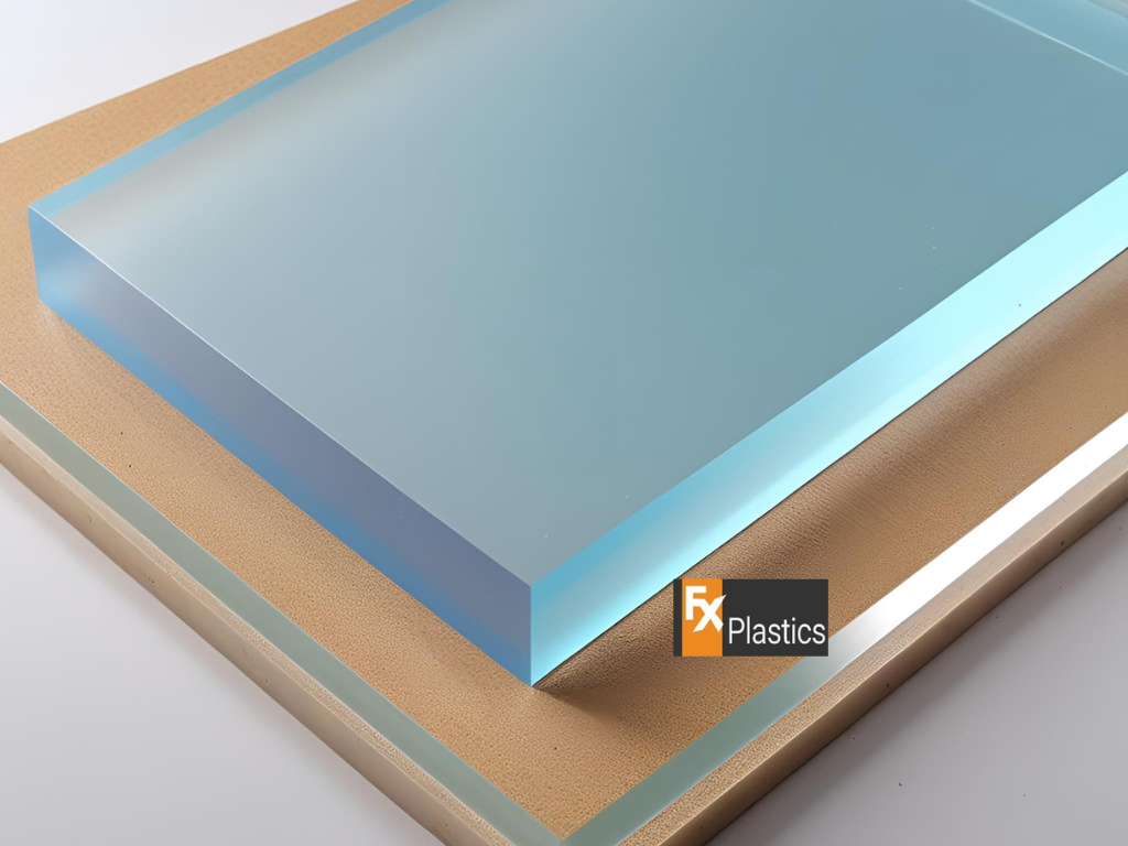
Gloss Acrylic sheets are shiny, reflective, and great for bold signage. Matte finishes reduce glare, which helps in brightly lit rooms or under spotlights. Frosted acrylic adds privacy and softness—great for doors or window decals.
Mirrored Acrylic sheets give a high-end look, especially in gold or silver. They’re great for signage in salons, retail shops, or luxury event spaces. Each finish offers a different feel, so it’s worth comparing samples before making your final choice.
Using contrast and layering in Plastic Display signs
Why does contrast matter in Plastic Display signage?
In any Plastic Display sign, contrast helps text and designs stand out. Without enough contrast, your message may blend into the background and get missed. For example, light grey on white doesn’t pop—but white on black or red on white is much easier to read.
If your Plastic Display is meant to grab attention (like for sales or promotions), go for bold contrast. For subtle branding, softer combinations work better—just make sure they’re still readable under different lighting conditions.
Can you mix colours for a layered, standout look?
Yes, and it looks fantastic! You can stack multiple laser cut acrylic layers in different colours to create a 3D effect. For example, a black background with raised white text and a red border adds depth and catches the eye.
This layering is commonly used in Plastic Display signs for retail, events, or business logos. It adds texture, makes the sign feel premium, and brings your brand to life with colour and creativity.
Colour options for CNC laser cutting and engraving
What colours work best for engraving vs cutting?
When it comes to CNC laser cutting, colour doesn’t just affect style—it also impacts how your design shows up. For engraved designs, lighter colours like white, frosted, or light grey reveal sharper detail when engraved. That’s because the laser creates a burn effect or shallow cut that contrasts well with pale backgrounds.
For cutting, darker Acrylic sheets like black, navy, or deep red look striking when shaped into letters or logos. These colours hold crisp edges and give a clean, bold finish. So, if you plan to use both engraving and cutting, consider using two-tone sheets or choosing a colour that supports both clearly.
Do certain colours handle CNC laser cutting better than others?
Yes. Not all colours behave the same under a laser. For example, mirrored acrylic needs more care during CNC laser cutting to avoid burn marks. Matte and frosted colours are generally easier to cut without leaving residue. Also, transparent colours—like tinted blue or green—can sometimes scatter the laser beam, so they need careful calibration.
That’s why it’s best to work with experienced cutters who understand how different finishes react. They can help you get clean results without warping, scorching, or uneven edges.
Best colour choices for laser cutting sydney clients
Which colours work best in Sydney’s retail and outdoor settings?
For clients using laser cutting sydney services, bold and high-contrast colours are popular for outdoor signage. Bright whites, blacks, blues, and reds all stand out well against building exteriors, especially under strong Australian sunlight.
In retail, clear and frosted Acrylic sheets are often used in boutiques, beauty salons, and food outlets. These finishes offer a modern, minimalist look that works well indoors and blends with a variety of interiors.
What do laser cutting sydney professionals recommend?
Professionals offering laser cutting sydney services often suggest using matte or frosted colours for indoor signage and gloss or mirrored finishes for high-impact branding. They’ll also recommend UV-stable colours for outdoor use so the sign won’t fade or discolour over time.
Before choosing, it’s a good idea to request samples or visit a local shopfront to see how different colours look in real-life lighting. A quick consult with your sign maker can save you from costly colour mismatches later on.
Matching retail perspex screens with acrylic signs
Should your sign colours match your retail perspex screens?
If you’re using retail perspex screens as part of your fit-out, matching them with your signage creates a unified, polished look. Whether it’s a point-of-sale counter or a divider, coordinating the colours and finishes with your laser cut acrylic signs can boost your brand’s style and consistency.
For example, pairing a frosted screen with frosted signage gives a clean and calm look. Or, go bold with gloss black signs matched with sleek black screens for high contrast.
How to coordinate signage with displays and fixtures
Start by identifying the finishes already in your store—timber shelves, brushed metal racks, pastel wall colours—and then select Acrylic sheets and retail perspex screens that complement them.
Using the same colour across your sign, screen, and display elements helps customers recognise your brand at a glance. It also makes the entire space feel more cohesive and professionally designed.
Tips on choosing laser cut acrylic colours
How to test colours before ordering
Before committing to a large order, always ask your supplier for colour samples of Acrylic sheets. Hold them up in your shop or room to see how they look under real lighting. Some colours may appear different under warm or cool lights.
Also, check how engraved text or graphics will appear on each colour. Engraving visibility can vary a lot depending on the shade and finish.
When to go bold vs neutral for maximum impact
Bold colours like red, yellow, or deep blue work well if your goal is to attract attention—great for event signage, shop fronts, or directional signs. Neutral shades like white, grey, black, or frosted are better for indoor signs or professional spaces like clinics, offices, or showrooms.
In the end, your colour choice should reflect your brand, your audience, and where the sign will live. With laser cut acrylic, there’s a wide palette to choose from—so don’t be afraid to get creative!